About Cliqz
Cliqz is a privacy-centric web browser looking to increase the number of installs of their smartphone app with women between the ages of eighteen and thirty-five. What follows is a marketing proposal aimed at connecting with this demographic.
Market Research
First, I did a little research on other successful campaigns with the female 18-35 demographic (here, here, here, and here). Then, I ran an Audience Insights analysis in Facebook Ads Manager. Just for the sake of this test, I targeted the American market. I narrowed the audience segment further by targeting women of this demographic who are interested in “internet privacy” and in “Mozilla.”
Some interesting insights: 80% of women in this demographic said they are reachable through Instagram. Also, this demographic responds to messages that promote a societal good or promote personal empowerment. As further proof of this tendency, women in this demographic held Sheryl Sandberg in higher regard than Kim Kardashian. This demographic is also more likely to partake in a hashtag campaign. Secondarily, this demographic also responds well to humorous advertising campaigns.
Digital Campaign

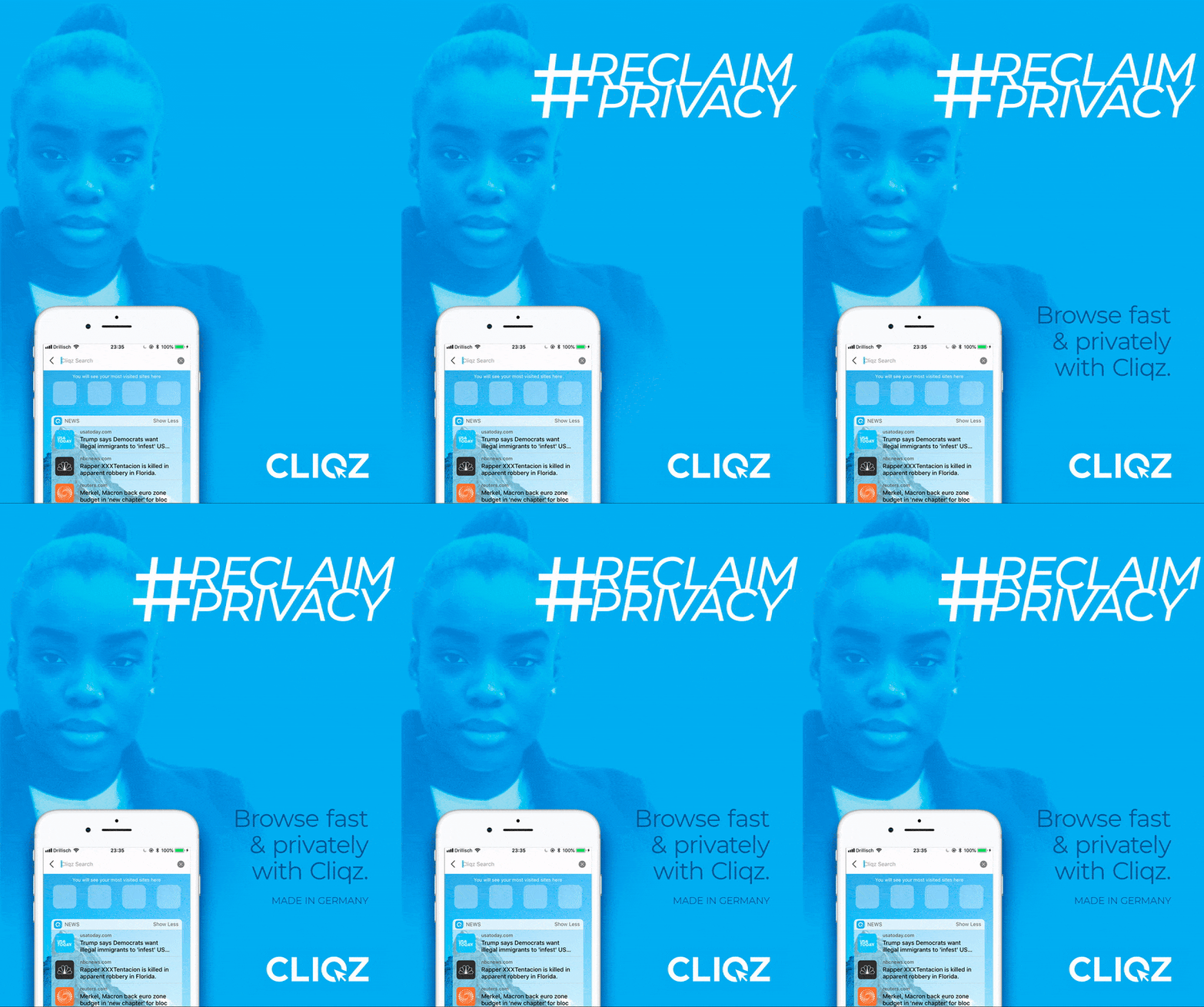
For the digital campaign, I chose a 4:5 Instagram video ad with an “Install Now” CTA.
Videos convert better than static graphics and videos that most utilize the vertical space tend to convert even better still. Also, by using video, we can avoid problems with Facebook’s 20% text rule — all we have to do is pick a thumbnail without much text.
Three societal “moments” I referred to in choosing how to shape this graphic were the #MeToo movement, female reproductive rights, and the NSA Snowden leaks.
#MeToo is all about women’s empowerment and the agency of women. Reproductive rights is all about choice: “my body, my choice.” The NSA scandal (going back to about 2013) was also about choice. One quote that resonated with me from that time, “Privacy isn’t about having something to hide, it’s about choice.”
I created two treatments of this campaign: one emphasizing this notion that privacy is about empowerment and choice; the other being a hashtag campaign built around that same message.
Print Campaign
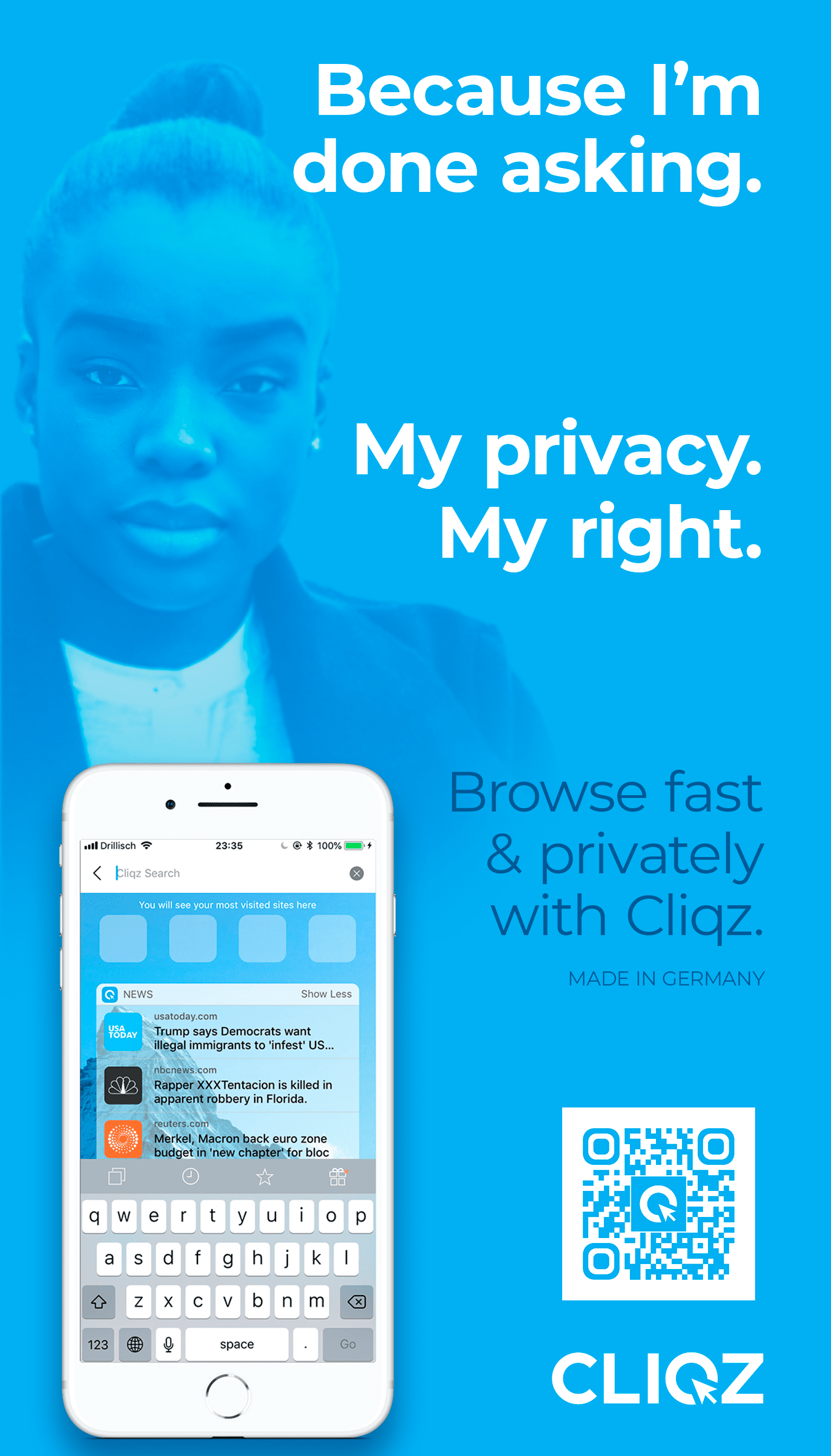

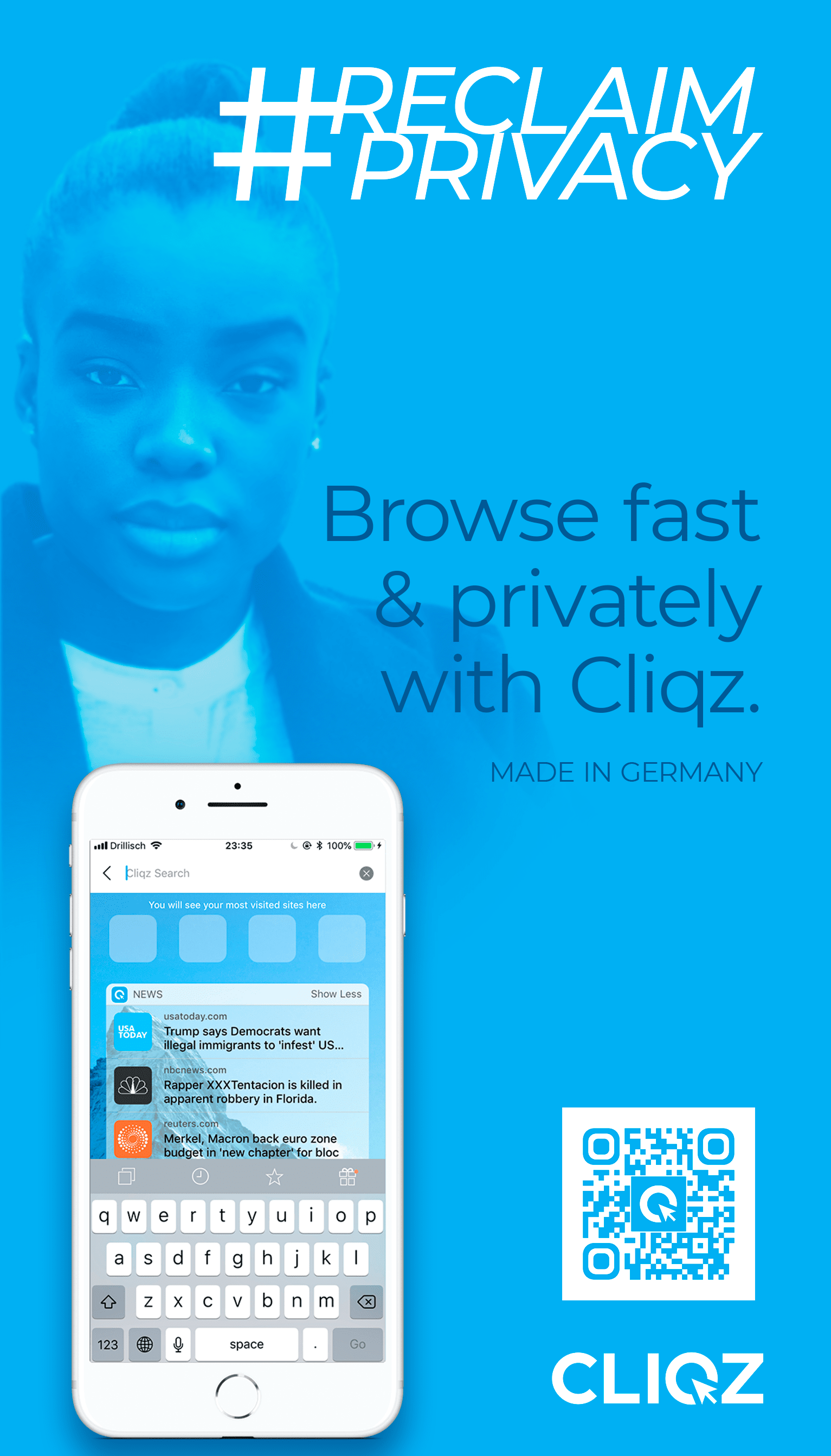
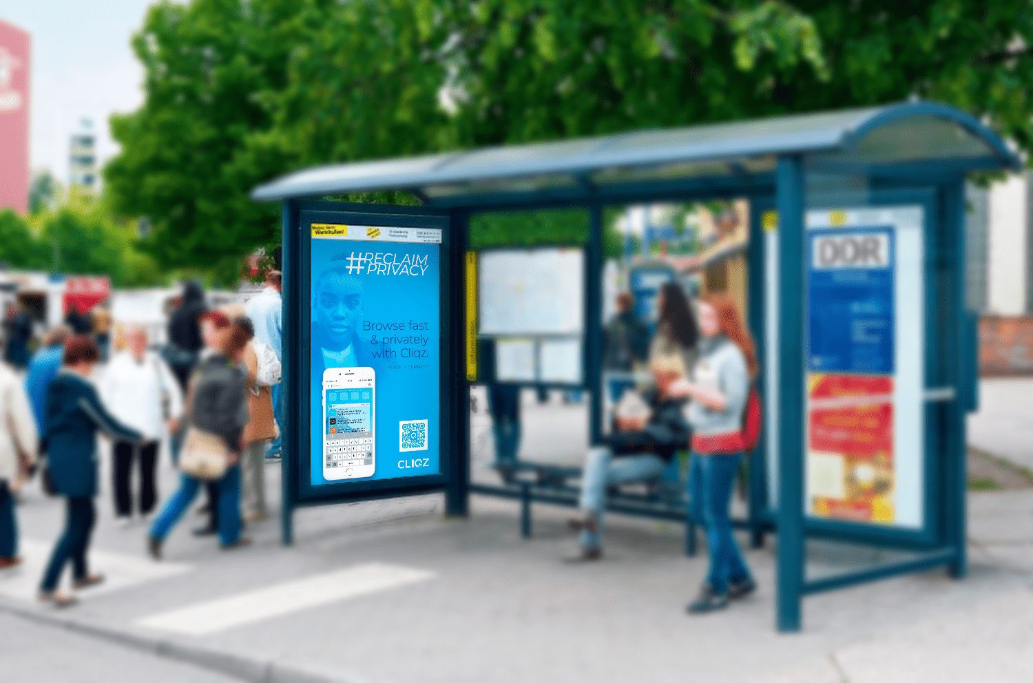
I adapted the two treatments for a display advertisement, and mocked up examples of what this graphic would look like in an actual mass transit stop. And, since the point of this campaign is to increase app installs, I slightly altered these graphics to include a QR code, reducing the friction between the viewing of the display ad and the conversion to an app install.
The general idea was to link Cliqz with this notion of empowerment — of taking your rights, without having to ask permission. “There is no discussion. There is no debate. Privacy is my right and I will claim it by installing Cliqz.”
Secondary Concept
As a secondary concept, I wanted to explore the humorous angle. Although I didn’t mock this up into full concept, it seemed sensible to provide this option since the initial market research indicated a humorous campaign could be effective.
The idea that came to mind was that of a negative avatar — a villain. Cliqz stands against privacy invasion. I thought it might be interesting to personify the creepiness of having one’s privacy invaded.
It’s sometimes easier to compartmentalize your message by showing what you stand against. So I thought it might be interesting to mockup a sort of villain that personifies all of the problems Cliqz wants to help its users avoid. The issue of digital privacy is a big one. It’s so big that we sometimes lose sight of why we want to protect our privacy. Very often we don’t even realize that, when our privacy is violated, there are actual flesh-and-blood, real people who are looking at our data and personal information... and this is pretty creepy.
The general idea is to give a face to the creepiness that’s inherent in the violation of privacy. Sadly, many women can relate to the idea of “creepy guys.” Whether it be at a bar or at work or online — most women have encountered a creepy guy before. They can relate to this. In fact, the #MeToo movement can be seen — in a certain sense — as a movement to expose such creeps.
However, I wanted to take an approach to this character that was cathartic. Laughing at the things that bother us is very empowering. In fact, I think all great satire helps us to laugh at our fears.
This first idea I had was to just use a stock image of some creepy-looking guy (using a similar layout as the first concept) and to change the tagline: “Because this guy shouldn’t see your browser history.” I imagine this would cultivate both a visceral and humorous reaction. Then I decided to take this idea one step further by boiling this concept down into a single image or character; it somehow makes it more memorable while creating a certain degree of emotional distance from reality (which is good in this case). So I decided to give this “creep character” a name: Sid.
I then mocked up an avatar graphic of what I thought this Sid character would look like. I modeled him largely after Terry Richardson (a man infamous for his creepiness). I imagine this graphic could work well on t-shirts, stickers, and other schwag. When people ask, “Who the hell is Sid?” Cliqz can respond: “Sid is every creepy individual that sees your private information because you don’t bother to protect your privacy.”
Tertiary Concept: Promotional Material
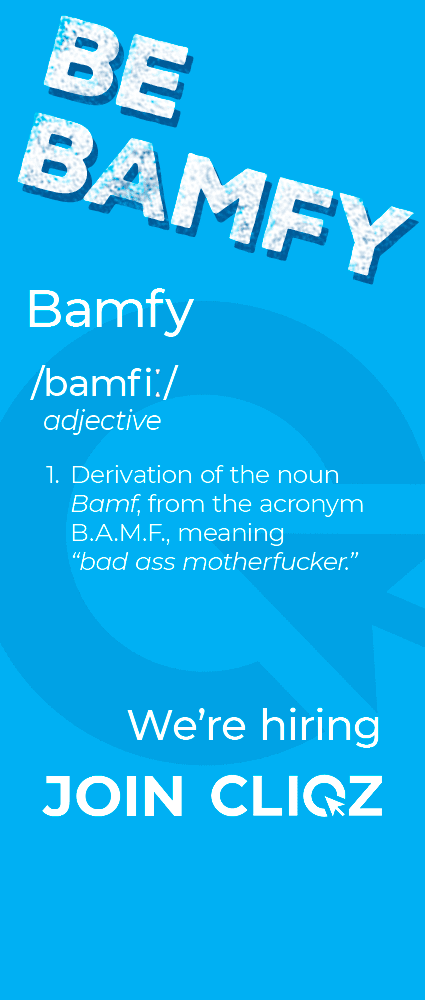
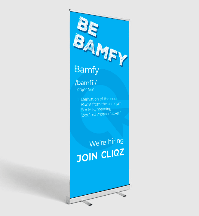
Borrowing from the irreverent attitude of my initial two concepts, I provided a third that could be used at trade shows and tech events for recruiting. I think this graphic would be a good conversation starter.
The word “bamfy” is funny to say and is likely to draw people closer; people would want to ask what the word means. Once they understand the joke, they will likely laugh. Starting a conversation with a smile and a laugh always makes the proceeding exchange far easier. The graphic captures the irreverent attitude of the company and would likely serve as a good icebreaker.
It's also worth mentioning that, while profanity might be seen as a little too extreme for a professional environment in predominantly English-speaking countries, Cliqz has its headquarters in Munich and does most of its recruiting in Germany. In the DACH region, I've found that the proverbial “f-bomb” doesn't carry with it the same degree of severity as it does in places like America. I've seen it used many times in professional marketing materials without causing offense (much the way a German swear word could be used ironically in an English-speaking setting without offending English speakers).
Bonus: UI Proposal
In my proposal, I also submitted a mockup of suggested changes to Cliqz's homepage.
I brought the entire page into a monochromatic color scheme and then surfaced the relevant information to the user. Borrowing some inspiration from Brave’s homepage, I presented the information to the user in terms of what she has gained — this adds an element of gamification.
In the case of Cliqz, users “build” upon the amount of data they’ve protected. It’s something they can grow and add to; it’s something that puts the user’s entire relationship with Cliqz into perspective.
To make the information even further relevant to the user, I presented the amount of data that’s been protected from collection in terms that she can more closely relate to: in this case, 2.4GB = 552 songs. To most people, a “gigabyte” is just a sterile number that doesn’t really mean anything. The average person understands that 552 songs is a lot of data. It’s just a little bit more personal.
I’ve also added a CTA for the user to share Cliqz with her friends. It’s phrased in a way that tells the user that she is helping her friends and those she cares about by informing them about Cliqz — she is helping them to protect their privacy.