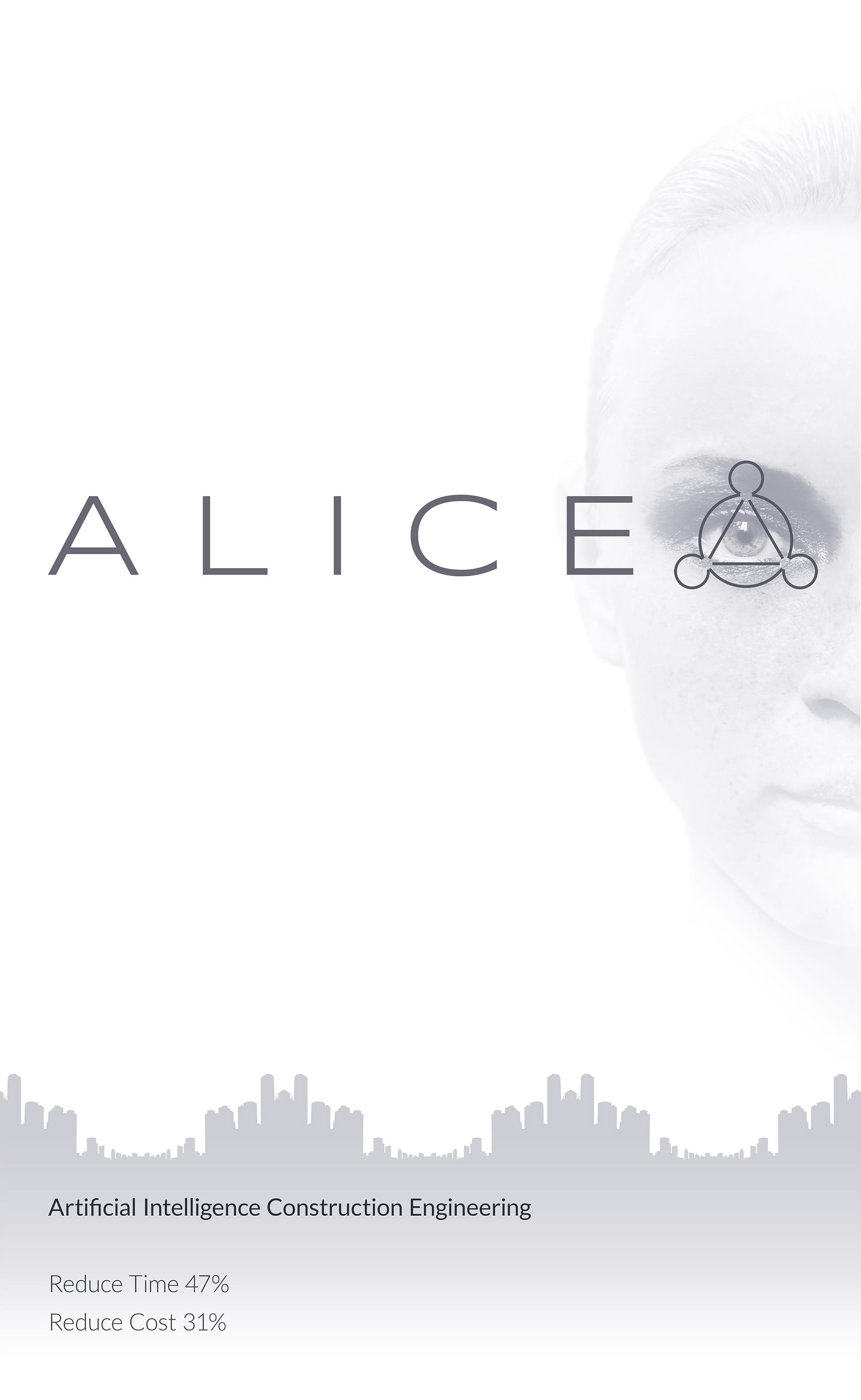
ALICE is a construction management company that uses machine learning and artificial intelligence to find the most efficient methods for scheduling construction projects. The client wanted to take an industry not typically associated with academia or technology - construction - and make it something "elegant," "sophisticated," "academic," and "sexy."
Side note: after presenting their product at Stanford's annual BASES product showcase, the ALICE team took 1st prize in the competition and was awarded $20,000.
Branding and marketing material.
The symbol over the eye was inspired by a graphical representation of something called the Levi-Civita Symbol, which is used to calculate mathematical permutations - much the way the ALICE software calculates numerous permutations of the same construction schedule.
The graphic at the bottom is a city skyline in the form of a sine wave.
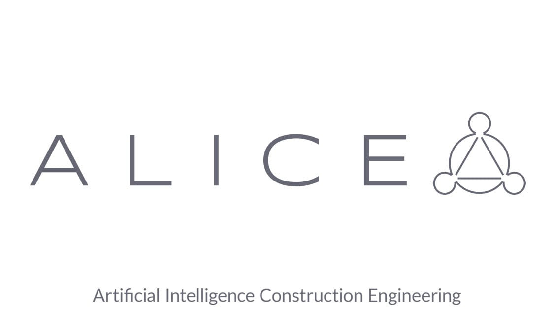
Branding and logo design.
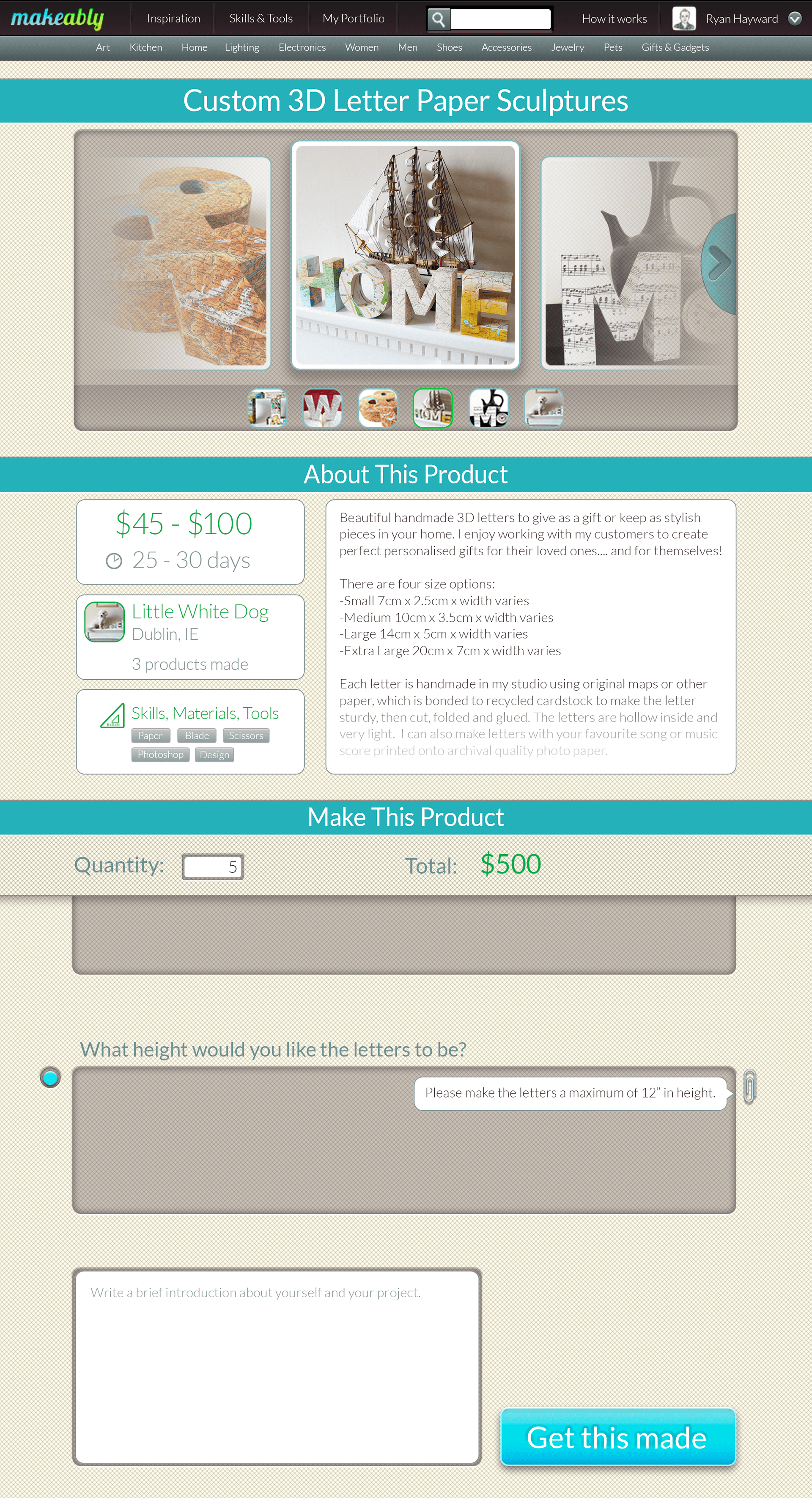
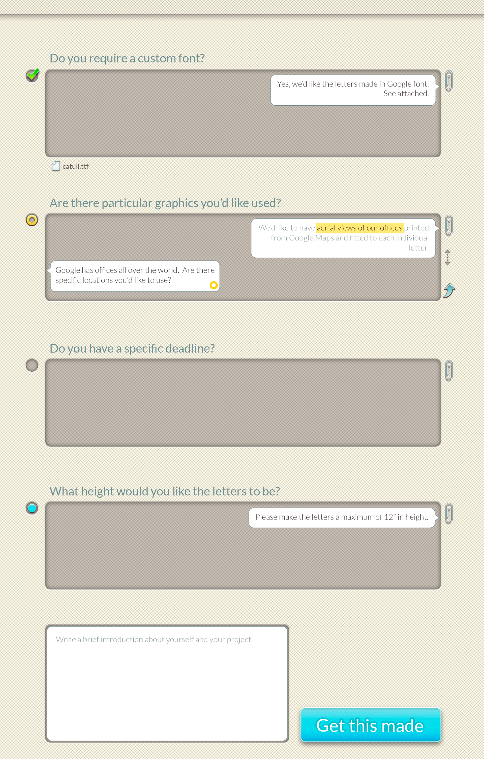
Below is a mockup for a company called Makeably. Makeably connects independent makers and buyers of low-volume, customizable products. When I first spoke to them, they were facing some "barrier to communication" issues. Buyers and sellers were having lengthy back and forth discussions before a product finally got made. Naturally, a few of them lost interest, and the development of the product never moved forward.
When doing these mock-ups, I was presented with an interesting problem: find a solution that would simplify communication between buyers and sellers, and design a page that didn't "feel" like an eCommerce page.

My first task was to create a unified color palette. Every color in this mock-up was selected from above.